

How might we...
design CGM apps for real life, not just clinical data?
How I redesigned the Freestyle Libre app to prioritise human context over medical metrics
Foreword: this is an old case study, with dated UI. So enjoy the UX thinking, disregard the 2010's UI.
TLDR
Freestyle Libre app is designed like clinical tool - tracking data for doctors, not insights for patients. It didn't prioritise everyday usability or human context.
Personal project: Research-driven redesign of Freestyle Libre app
Type 1 diabetics commonly develop vision issues - yet app ignores accessibility
App doesn't capture context (food, stress, exercise) that actually explains blood sugar changes
Redesigned to prioritise everyday context over raw data
THE PROBLEM
App treats diabetes like a data problem. Doesn't capture context, no accessibility.
THE JOURNEY
Diabetic patients using CGM testing and logging blood glucose.
THE APPROACH
Redesign around real-life context: logging, long-term patterns, night mode.
ROLE
Personal project. Research, strategy, design, validation. Drawing on lived experience as Type 1 diabetic.
IMPACT
GETTING STARTED
If you’re a little unsure what diabetes is — I recommend having a quick skim of this NHS site. Even if you don’t read the rest of this case study, you might meet an attractive diabetic one day and need a more appropriate response than— ‘Oh yeah…I think my cat had that. We had to put him down.”

Living with diabetes means tracking everything
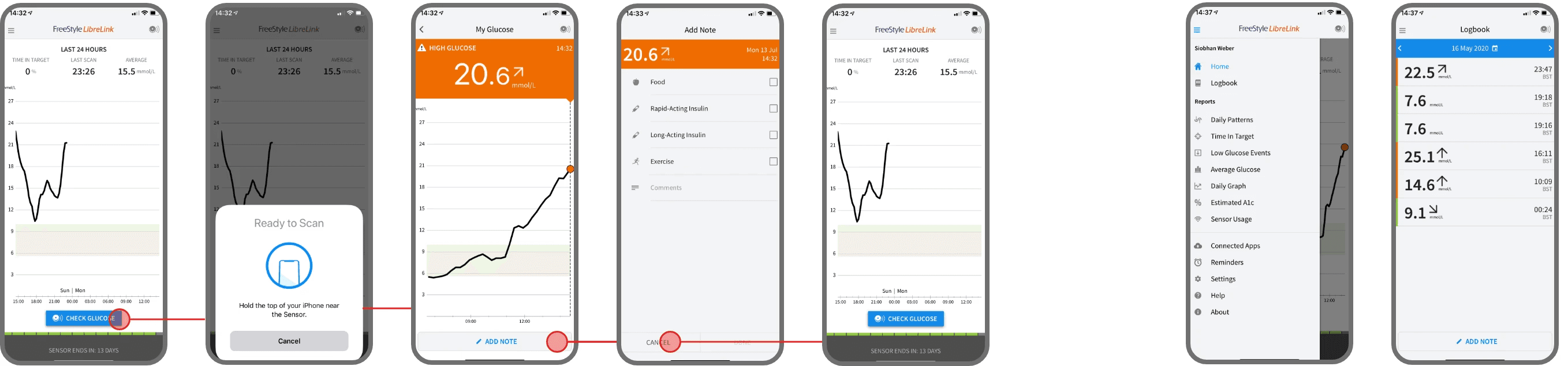
I’m a Type 1 diabetic, and I use a CGM (Continuous Glucose Monitor) called Freestyle Libre - a small sensor stuck to my arm that tracks my blood sugar 24/7 without finger pricks. It’s incredible technology. Genuinely life-changing. I have a tiny sensor continuously monitoring my glucose levels and sending data to my phone. We’re living in the future. Except the app designed to make sense of all this futuristic data looks like it was built by someone who’s never actually had diabetes.

The app is designed like a clinical tool. It prioritises data collection over patient insight. It's built for what doctors need to see in a 15-minute appointment, not what patients need to manage their condition daily.
PROBLEM
Doesn't capture context
No way to log food, exercise, stress, medication changes, illness - the things that actually affect blood sugar.
PROBLEM
Single readings, not patterns
Hard to see long-term trends or scroll back through history. Each day is isolated.
PROBLEM
Effort to log anything
Clunky interface makes logging feel like work, not helpful.
PROBLEM
Ignores accessibility:
Bright interface when diabetics check blood sugar at night. No consideration for vision issues
This isn't just frustrating. It's dangerous. When patients can't understand patterns, they can't make informed decisions about insulin, food, exercise. The data is useless without context.
RESEARCH INSIGHTS
The accessibility crisis nobody's talking about
What's crazy is that diabetics are far, far more likely than most users to have vision issues. So it's shocking that a medical app like this has essentially ignored basic accessibility guidelines.
50%
of Type 1 Diabetics have some form of retinopathy
30
people a week have eyesight seriously affected by diabetes
99%
of people who have had diabetes for 20 years have eyesight issues
I did research with other diabetics to validate
What I learned
App doesn't align with diabetic mental model
People already track food, exercise, stress in their heads or in separate apps. They want to connect those dots to their blood sugar, not just see a graph.
No broad overview or long-term patterns
Scrolling back through days of data is painful. But that's where you actually spot what's happening - "my blood sugar is high on hot days" or "I crash after swimming."
Too much effort for basic tasks
Every additional tap to log information or view history adds friction. When you're checking your blood sugar 10+ times a day, friction compounds.
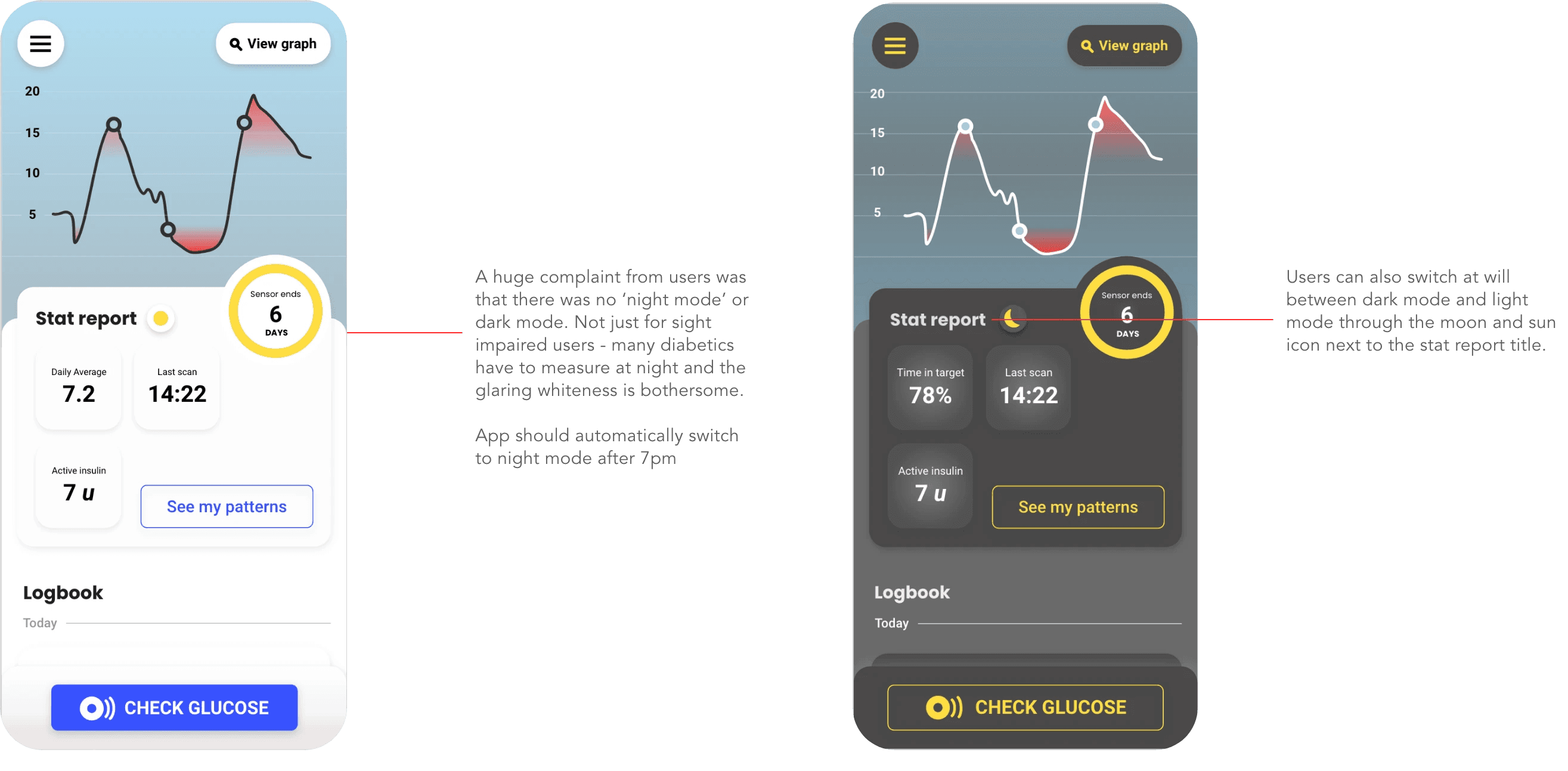
Night mode isn't optional
Multiple diabetics mentioned checking blood sugar at 2am and being blinded by white screens. For people with vision issues, this is even worse.
Data without context is just numbers. "My blood sugar is 8.2 mmol/L" - okay, why? What do I do about it? The app doesn't help answer those questions.
APPROACH
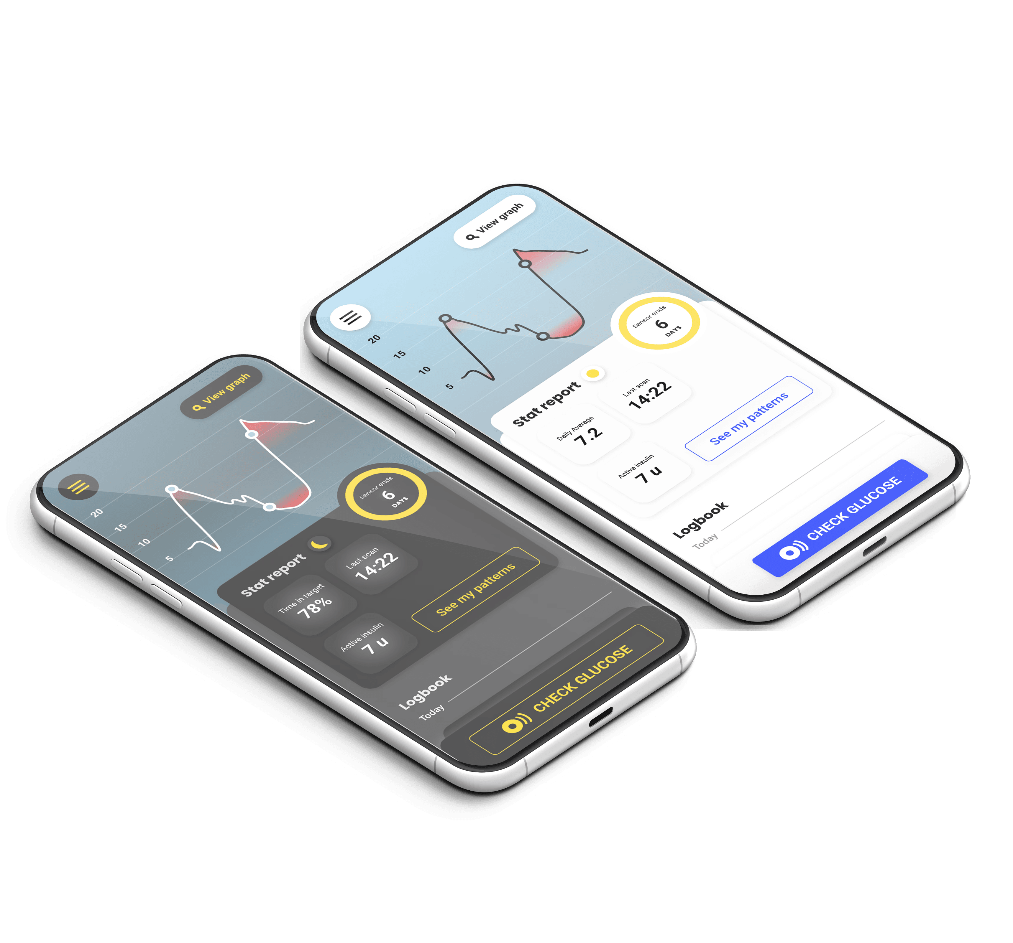
What I redesigned
Context, everyday usability, and pattern management
Reduced taps for common actions. Made logging feel fast and helpful, not like homework you're avoiding.
Monthly and weekly overview screens showing trends, not just individual readings. Scrolling back through weeks of data to spot patterns manually is unrealistic - this surfaces them visually.
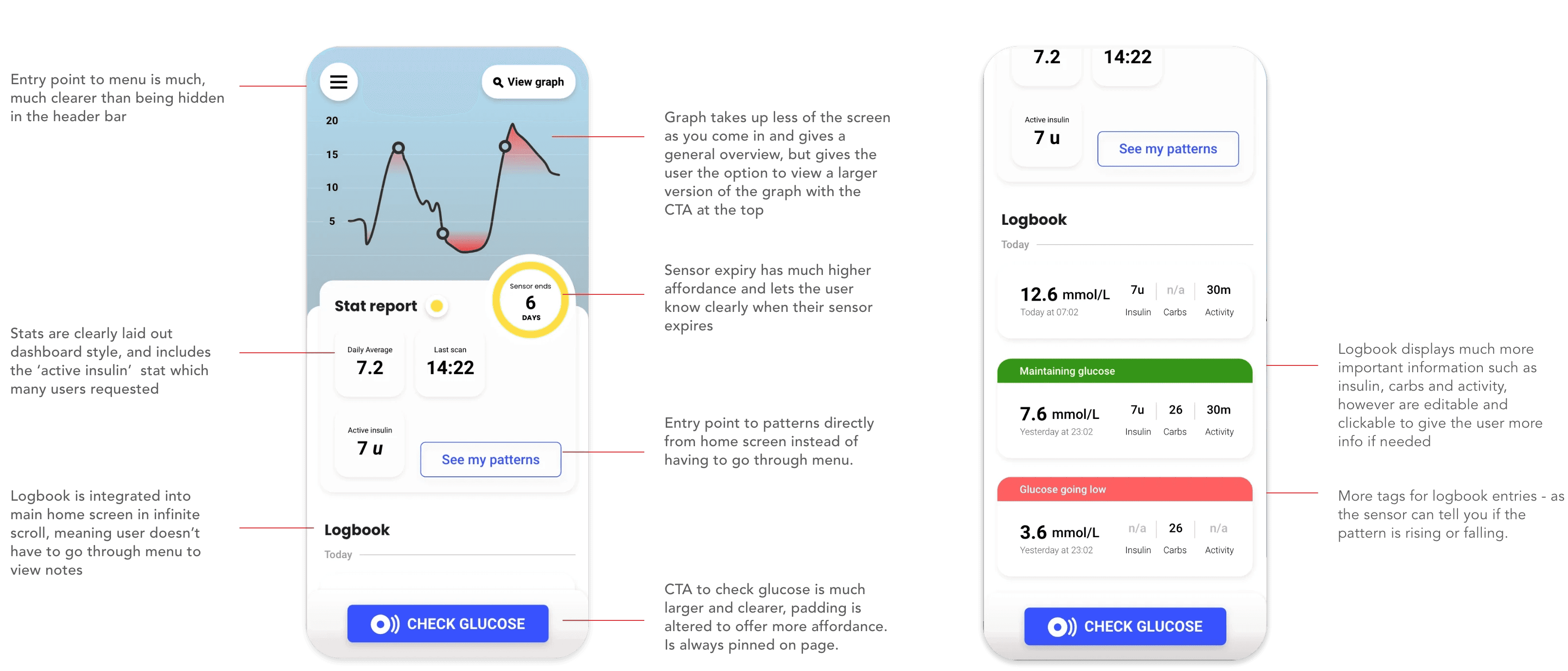
Graph view for context, patterns, and ease
Diabetes isn't managed day-to-day. It's managed over weeks and months. You need to see: "My blood sugar is consistently high on Mondays" or "I always crash after certain types of exercise."
Monthly and weekly overview screens showing trends, not just individual readings. Scrolling back through weeks of data to spot patterns manually is unrealistic - this surfaces them visually.
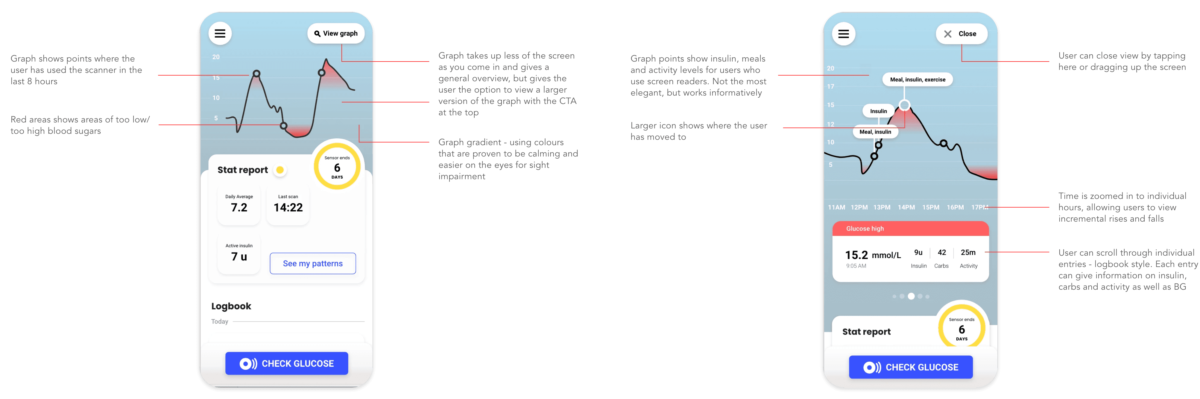
Contextual logging
In interviews, every single diabetic mentioned trying to figure out what caused blood sugar changes. They were already doing this mental work. The app just wasn't supporting it.
One participant said: "I know I need to track what I eat, but opening a separate app to log food and then checking Libre and trying to remember what I ate 2 hours ago... I just don't do it."
So I made context logging part of the blood sugar check flow. One action, all the information captured together.
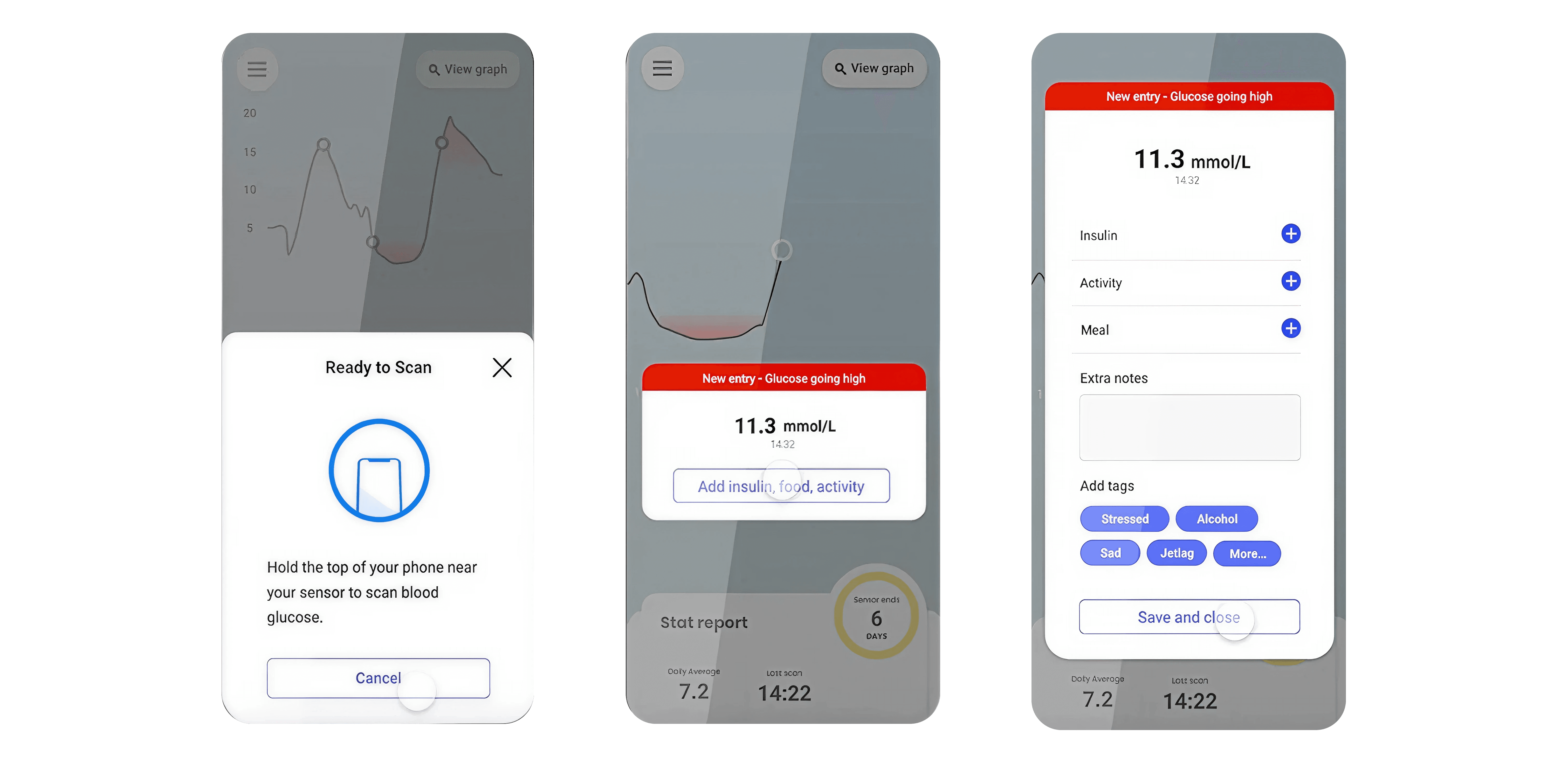
Night Mode
Dark interface option for nighttime checks. Diabetics check their blood sugar at night constantly. Bright white screens at 2am are genuinely painful, especially for people with vision issues. Multiple participants mentioned this unprompted. Diabetics check blood sugar at night - during sleep, when they wake up, before bed. A blinding white screen at 2am is genuinely painful, especially for people with vision issues.
This should have been a default feature, not an afterthought.
TESTING
Validating through testing
Context logging
All 4 said they'd actually use this feature. It aligned with how they already think about their diabetes management.
One said: "This is what I've been trying to do in my head for years."
Pattern view
Unanimous positive response. Participants immediately spotted patterns in the demo data they wouldn't have seen otherwise.
"I didn't realise how much my stress affects my blood sugar until I saw it like this."
Overall usability
Every additional tap to log information or view history adds friction. When you're checking your blood sugar 10+ times a day, friction compounds.
Night mode
"FINALLY!".
Enough said. There was a reason that it was the most requested feature on the app store.
Why this matters for digital therapeutics
Medical devices and apps often prioritise precision and data collection over usability and insight. This makes sense for clinical tools used by healthcare professionals. But patient-facing apps need different priorities.
Patients don't need more data. They're drowning in data. They need:
Context to understand what the data means in their actual life
Patterns to make informed decisions over time
Accessibility because chronic conditions often come with complications
Low friction because they're using these tools constantly, not occasionally
The research validated what I knew from lived experience: diabetics are already doing complex pattern recognition in their heads. They're already tracking context in separate apps or notebooks. They're already trying to make sense of their data.
The app should support that work, not ignore it.


Ready to see more?
Click through to the next case study for more high-octane UX fun
See next case study: Zava Dosage Guide
