How might we...
deliver personalised reassurance at scale?
Designing a guidance tool to fill the gap between talking to a doctor and ‘just googling your symptoms’
TLDR
Zava was built for transactional healthcare: patients request treatment, we deliver it. But long-term treatment patients were dropping off because we had no support infrastructure.
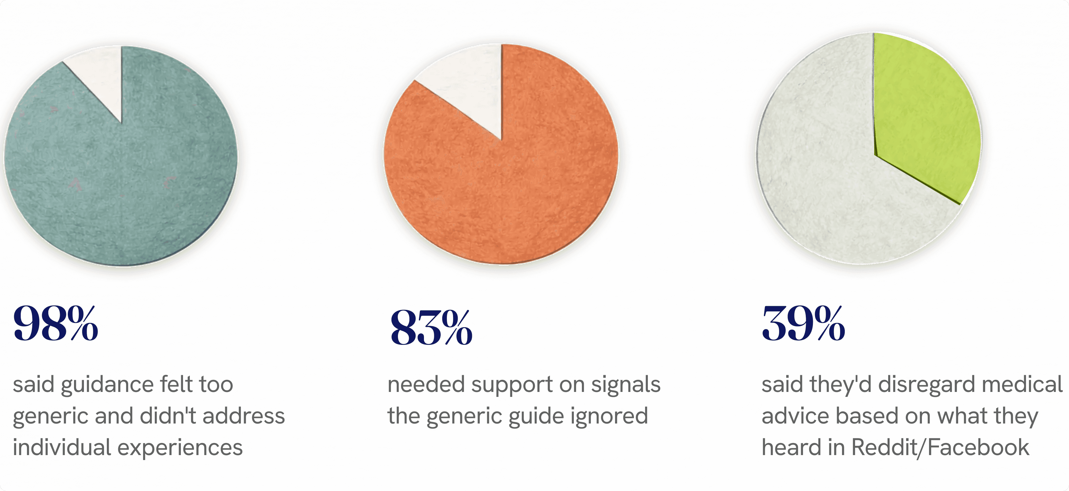
At treatment decisions, patients were 4x more likely to drop off when concerns weren't addressed
Research revealed systemic gap: patients need personalised support, not generic content
Built scalable tailored guide framework, strategically deployed for single service with highest ROI
THE PROBLEM
Transactional model failing. No support infrastructure. Low retention.
THE JOURNEY
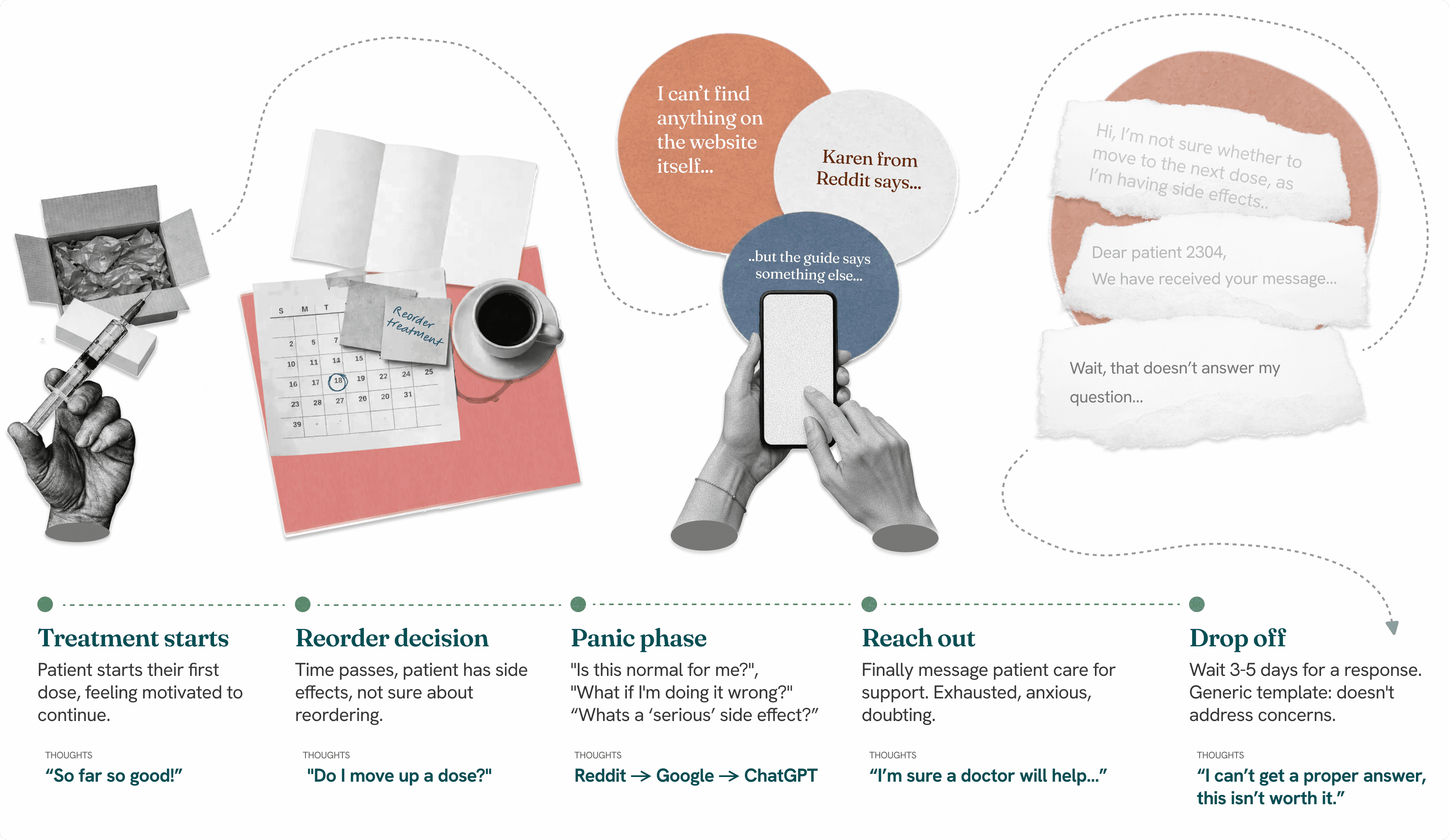
Patients on long-term treatment journeys seeking support before re-order.
THE APPROACH
Scalable guide framework capturing nuance, delivering tailored doctor advice.
MY ROLE
Product design lead: partnering with PM to prioritise roadmap. Led on research, delivery and execution. Worked closely with: PM, doctors, data team, patient care team, content, commercial
MY IMPACT
GETTING STARTED
I'm Type 1 diabetic, so I get given a lot of information. PDFs, dosing charts, pamphlets. But it's not what I actually need.
Because life doesn't happen in the neat situations described in the guides. What about when I'm stressed? Haven't slept well? Coming down with something?
Here's what I actually need in those moments: someone to tell me "this is normal, given your exact situation right now." Not another pamphlet. And nothing feels worse than panicking, going to the doctor, and finding out it was nothing. So I do what everyone does: Reddit, ChatGPT, Google. Hoping someone's got exact advice. Instead I find the best and worst case scenarios - something between ‘I’m dying’ and ‘I guess my elbow just hurts’.
This is exactly what was happening at Zava. We were pouring content at patients-guides, FAQs, medical PDFs. They weren't reading any of it. They were going to Reddit instead. Because Reddit gave them "I went through this exact thing and here's what happened" while we gave them walls of generic medical text.
The gap isn't information. It's personalised advice.
PROBLEM
No central support hub
Support content was scattered, difficult for patients to find, and too generic for long-term treatment.
PROBLEM
Only support through calls or messages
When backlogs were busy, patients waited days for generic templates.
PROBLEM
Low retention
Drop-offs at every treatment decision point across long-term services.
The business model problem: we needed to shift from "request, deliver, done" to "we're here for the whole journey." We couldn't hire infinite patient care staff to send bespoke messages at every decision point. We needed something scalable.
RESEARCH INSIGHTS
Understanding the patient perspective
From a series of in-depth user interviews and testing, several key themes came to light
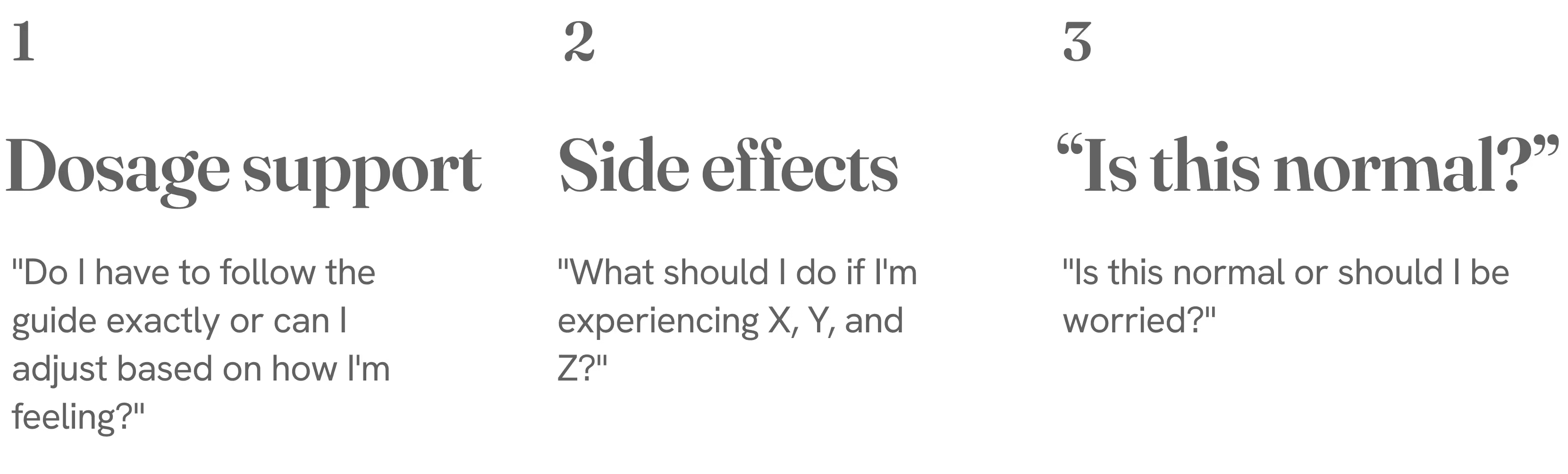
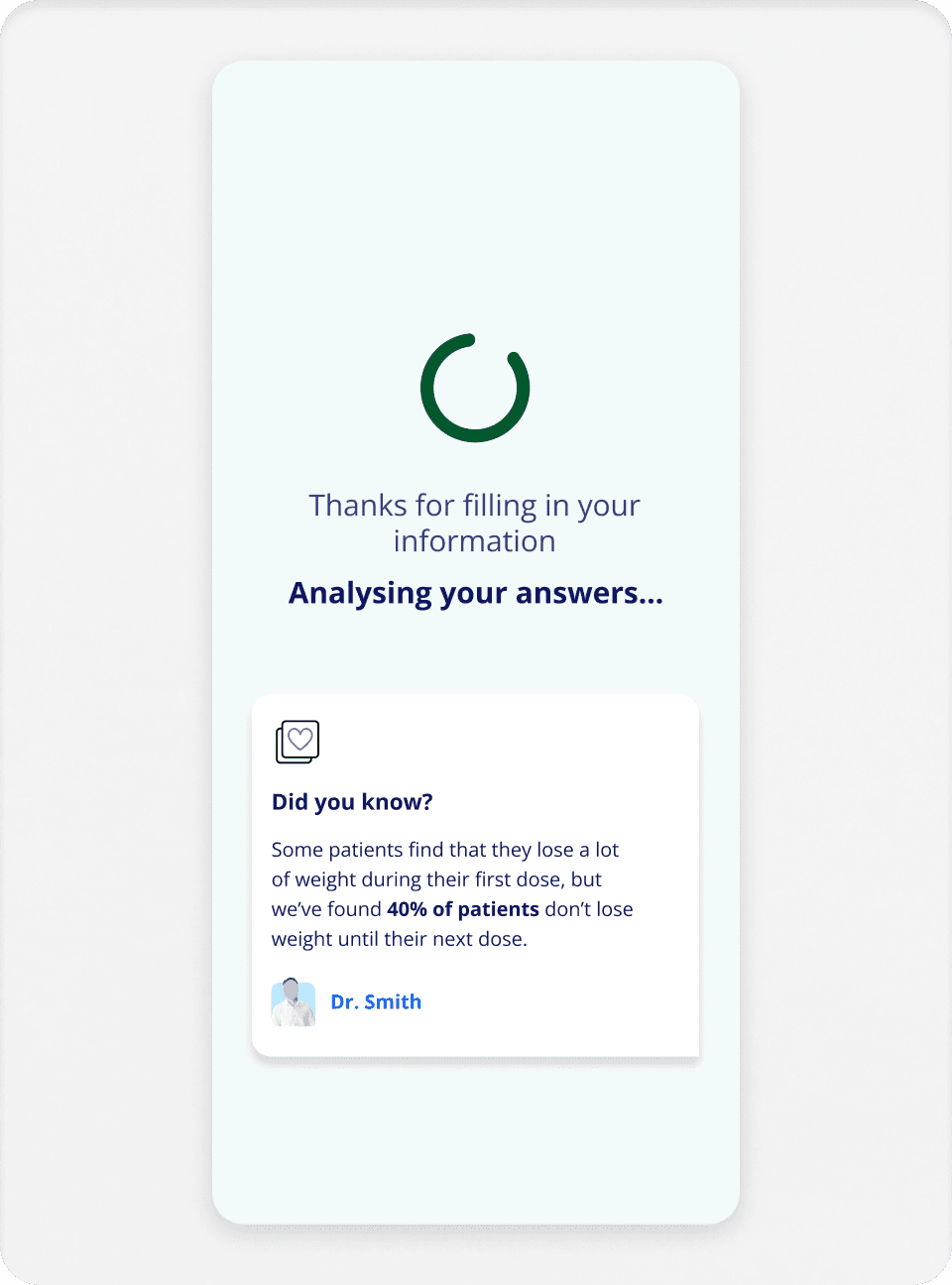
Patients needed support so much, they were more likely to turn to Reddit and Facebook groups to get advice from people who'd been through it. That's the gap - patients trust strangers on the internet over our generic content, because at least Karen on Mumsnet can give you plain language advice.
Here's what community platforms gave them that we didn't:
Validation
"I experienced this too" - proof they're not alone or abnormal
Context
"This is what worked for me" - not generic rules, actual lived experiences
Specificity
Real people describing exact dose, exact side effects, exact outcomes
Permission
"I went down a dose and it was fine" - showing there's flexibility
It all makes logical sense - but a difficult challenge to balance medical credibility, personalisation and resource. We needed to create something that was in between - not the generic medical guidance, not the Reddit rampage full of misinformation, and not something that would require doctors and patient care to write full personalised messages to each patient. We just wouldn't be able to hire that many people.
APPROACH
Solutions we rejected: “Why don’t we just use AI?”
Ah yes. The phrase every designer heard last year. When stakeholders say "AI," they mean chatbot. After spending two years working with Vodafone on the TOBi chatbot, I know how this ends: patients frustrated with a Mr. Clippy-style bot whose best response is "I'm not sure, message a doctor."
And even then, if we build a chatbot detailed enough to help but vague enough to avoid medical liability, why wouldn't patients just use ChatGPT? It pulls from anywhere. Even Karen from Mumsnet, and at least Karen speaks in plain language and isn’t afraid to give you very specific (if wrong) advice.
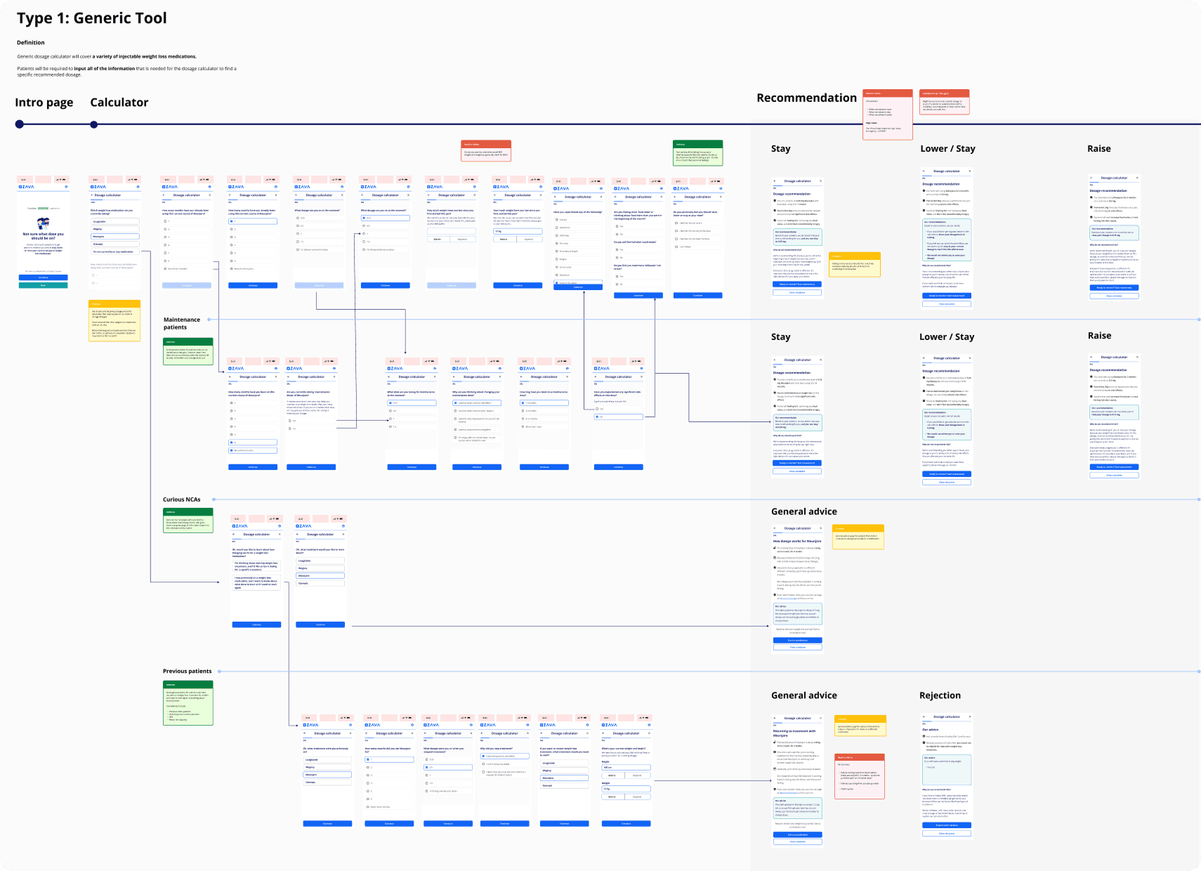
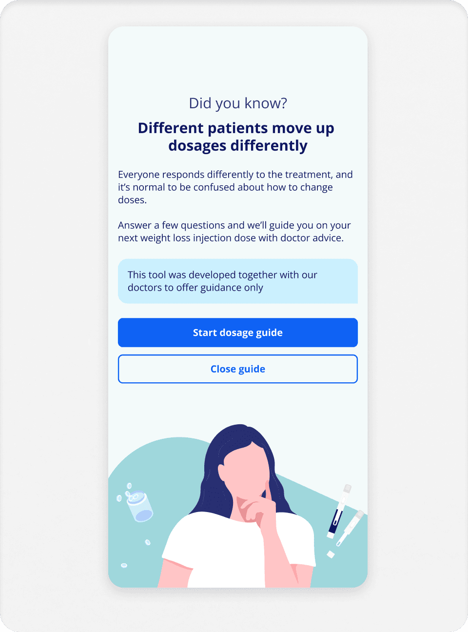
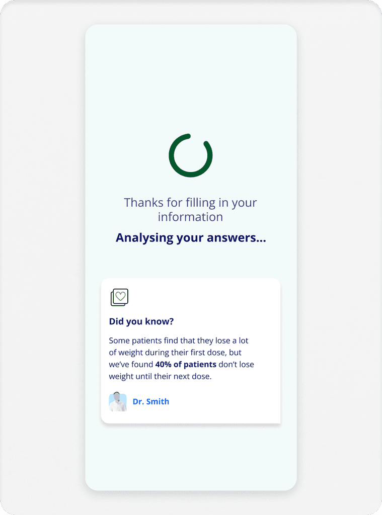
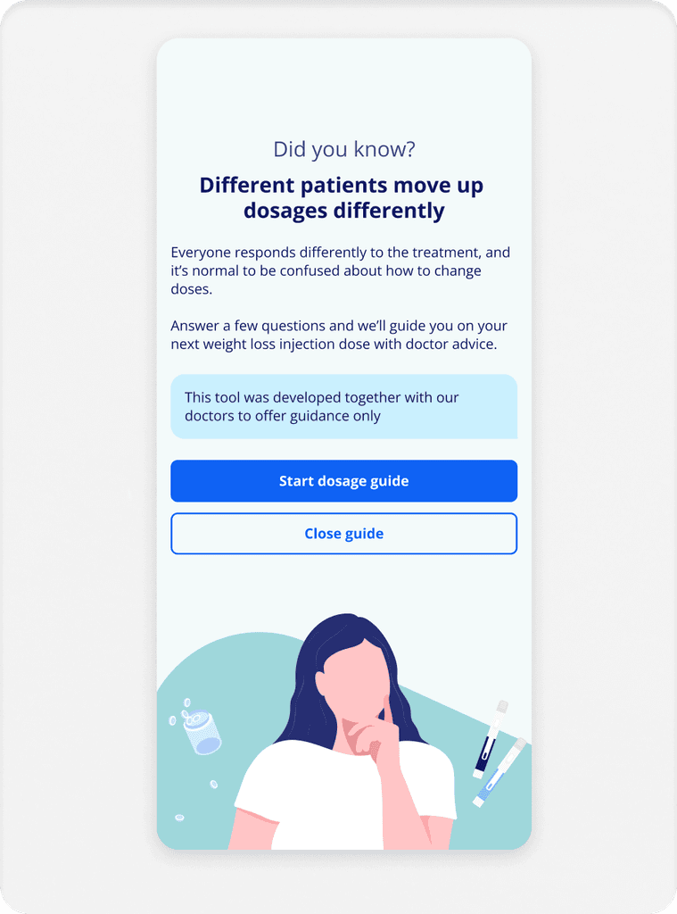
How it works
Patients input:
Medication type, current dose, side effects, how they're feeling, mental wellbeing, lifestyle factors, food noise, weight metrics.
Guide outputs:
Clear recommendation (move up/down/stay), explanation why, community proof (stats + patient quotes), accordion for specific advice.
The guide would have entry points at all relevant points of a patient journey, such as in the patient account and newly created support hub.

KEY FEATURES
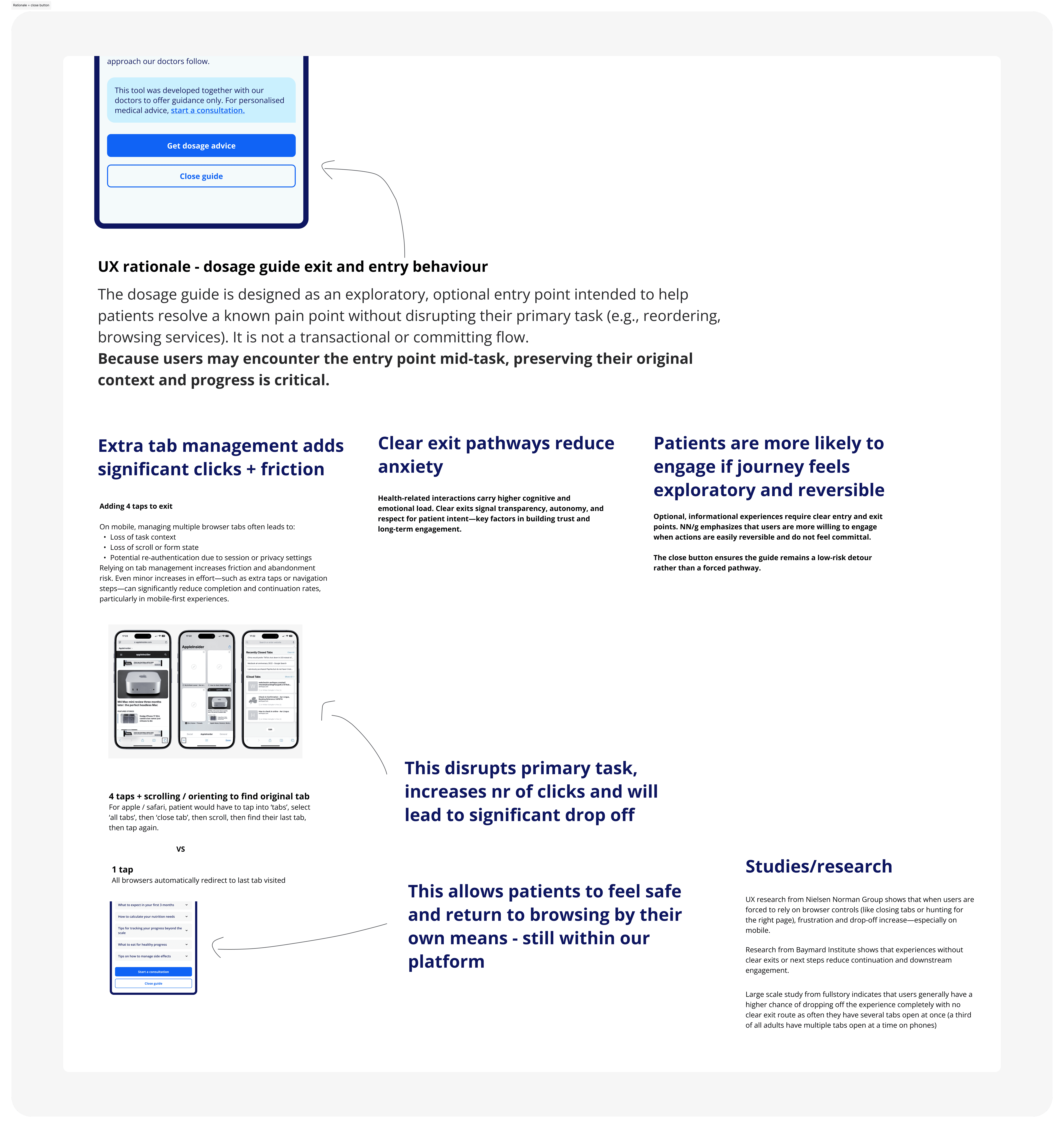
Clear exit pathway
FUTUREPROOFING
Scaling the concept
The back-end architecture shift
This proved the value of shifting from "individual requests" to "treatment journeys." We started building backend infrastructure connecting requests as cohesive plans, unlocking the ability to serve relevant support at the right time.
Huge upgrade for doctors: view entire journeys at a glance, analyse metrics over time, get holistic patient health pictures. This isn't just a feature. It's proof of concept for an entirely different business model.
Shifting a business model, not just shipping a feature
The shift from one-off order to long-term treatment support means that as a platform we are able to cater for a more diverse audience, while still being able to offer the services that patients still need - an order of antibiotics for a UTI or the morning after pill.
The business was heavily relying on elements like hidden FAQ pages, banners, messages, or emails to attempt to support patients, often only catching them when it was too late to gain back trust. Patients on long-term treatment plans need to feel supported at every stage, not just when they’re at their most anxious.
A big learning from this initiative was sensing the impact of real patient insight on the rest of the organisation - this was a truly research led concept where we used data to see the ‘what’, and instead of creating assumptions, delved much deeper into patient behaviours and mental models to create something bespoke and incredibly effective. There was a noticeable shift of focus from initial conversion to long-term retention, where the
It also nodded to a shift from ZAVA just ‘catching up’ to competitors to creating something truly innovative - the dose guide is first of its kind among our direct competitors.
Ready to see more?
Click through to the next case study for more high-octane UX fun
See next case study: BMI Verification